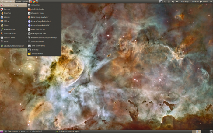
Ubuntu's New Look is Just Right
It sounds a little shallow, but one of the largest obstacles in my personal desktop Linux adoption in the past has been the lack of overall polish across applications in most major distributions. It doesn’t get to you right away, but eventually, you grow tired of aesthetic artifacts like huge fonts in some applications (Thunderbird and emacs-gtk were complete messes), font colors that are nearly indistinguishable from the background, non-transparent tray icons, and, of course, unappealing default themes (Ubuntu’s old brown, for instance).
I’m happy to see that Canonical have done a near-perfect job of solving this problem in their latest installment of Ubuntu Linux, Ubuntu 10.04 Lucid Lynx. It has a few problems (namely, I think the relocation of the Minimize/Maximize/Close buttons was unnecessary), but I’ll be damned if it’s not the most polished and aesthetically pleasing Linux release I’ve used to this day.
I’ve always liked dark colors, but when the majority of the screen real estate is occupied by the browser — which is almost invariably displaying something contrast white — it quickly gets tiring, so I’ll admit that my first thought when seeing the new default theme was, “Bah, not dark!”. To my surprise, Ubuntu 10.04 hits a perfect balance that is classy and easy on the eyes; the kind of look that competes with OS X’s Aqua and Windows’ Aero. Pair this with X.Org’s superior font rendering and it’s clear that Linux isn’t the laughing stock of the aesthetics department any longer.
Best of all? This look is unique. Canonical isn’t copying anyone.
X.Org font rendering: 
